Adobe Jumps the Shark

Adobe has decided to focus its resources on Creative Cloud and will not continue development on its Creative Suite software, reports The Next Web. While Creative Suite 6 will continue to be supported in regards to bug fixes, there will be no further updates and no Creative Suite 7.

Instead, the company has today announced several Creative Cloud apps at its Adobe MAX conference, including Photoshop CC, InDesign CC, Illustrator CC, Dreamweaver CC, and Premiere Pro CC.

There will be backlash for this, no doubt.
Adobe targets the same Pro and Pro-sumer community that Apple had the misfortune of knowing when it redesigned Final Cut Pro. Adobe’s decision to solely embrace a subscription offering could lead to mass protest if not handled correctly.
But before grabbing your torch, let us explain what, exactly, is happening — then we’ll get into why.

So this is just horrible.  What if our internet goes down?  We just pack up shop for the day and tell our clients sorry?  What about those clients who let their subscriptions lapse? Now they can't open PSDs anymore to see the files and their decades old archive is "unreadable"?  Pay a subscription to Adobe or your entire library is up for ransom? This is insane...​  

I'd say I'd just stick with CS6 but Adobe will not release new RAW camera support for older versions, trapping you in this upgrade cycle.  Between Apple and now Adobe abandoning the WORKING professional markets where are we left to go? Someone smarter then me really needs to target working pros in creative fields not everyone can or wants to work off a damn phone people.
Source: http://forums.macrumors.com/showthread.php...

The Process.

The George Eastman House has done a series of videos about the major steps of the Photographic Process ending with the Gelatin Silver Print.  Interesting to me that it does not go into Digital which I would consider the biggest, most important change to the medium since it was created. 

The Dageurrotype, The Collodion Process, The Albumen Print, The Woodburytype, The Platium Print, and The Gelatin Silver Print.


Source: http://www.metafilter.com/

Focus Stacking Tut

Adventure photo journalist Jay Goodrich highlights how he overcomes diffraction issues with today's digital cameras and lenses by stacking multiple focal point images in Adobe Photoshop CS6 via Adobe Lightroom 4.

This is a very handy technique for all shooters IMO.  I suggest using it on many shoots.  At least shoot for and then have your post guy do all the mucky muck of the tweaking.  Think of it all as information.  

While I am on the topic, ALWAYS shoot plates. Always.  Clear the set and take 5 steps back and shoot a clean set. ​My god people, almost every job the clients asks for more space on the left and we are trying to figure out how to recreate a airport / field / set / bar / gold course / stadium / you name it.

We Need A Standard Layered Image Format

Last summer, Adobe killed their image exchange format "FXG". The idea was to have a publicly defined XML based image format which could handle vectors, bitmaps, and layers, and could be read and written by any app that wanted to support it (as Acorn did for a while).

I can't say I'm sorry to see it go. It was a horrible format. The goal is worthy, but the implementation of it was an incredibly bad idea. When you want to send someone an image you want to pass them a single file, not an XML file with a folder of assets. While there are technical benefits to this, it's an incredible burden on the customer.

There is of course PSD which is the native format for Photoshop, and over the years it has become the de facto standard for layered images. PSD is a crazy format and implementing a reader and writer for PSD files is non-trivial and nobody but Adobe actually supports it correctly. It's crazy hard (and I'm not blaming Adobe or PS engineers for this- extending a file format for 25 years isn't exactly an easy thing to do).

So what would be better?


Source: http://shapeof.com/archives/2013/4/we_need...

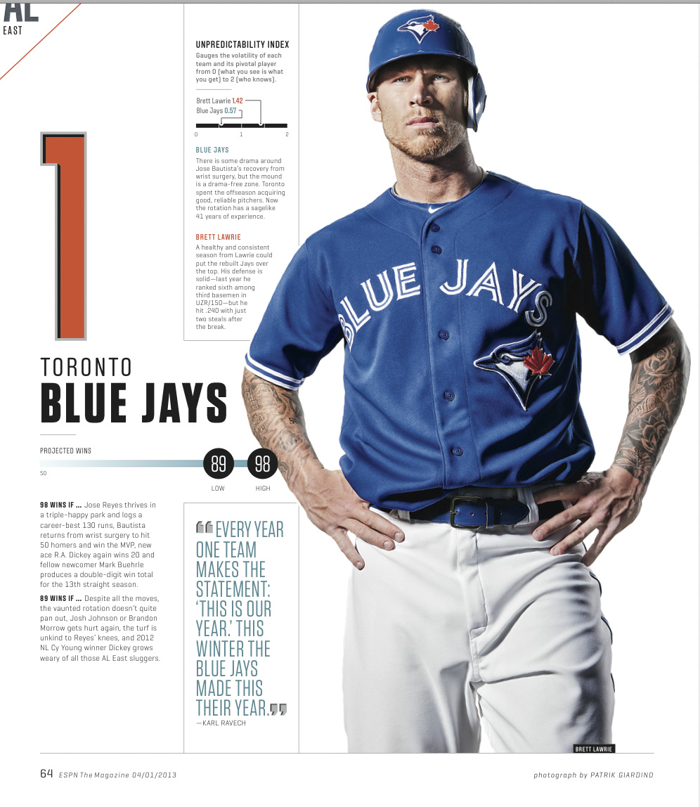
Patrik Giardino for ESPN

Patrik Giardino asked us to get this kind of look for one of his ESPN shoots and here it is in print.  Great shot Patrik and thanks!

Looks much better then the other shots in the spread by other shooters but I miiiight be biased. ;)​

Kodak to Sell Its Film and Imaging in $2.8 Billion Deal

Eastman Kodak Company today announced a comprehensive settlement agreement with the U.K. Kodak Pension Plan (KPP), its largest creditor, with respect to its Chapter 11 Plan of Reorganization. Under the agreement, which will be filed with the U.S. Bankruptcy Court, Kodak’s Personalized Imaging and Document Imaging businesses will be spun off under new ownership to KPP.


I used to order so much paper from them. So crazy how they missed the how switch to digital so badly.

Source: http://www.kodak.com/ek/US/en/Kodak_Announ...

Portrait shoot: Parasols

Did a shoot last night for the band Parasols here in the Studio last night.  Parasols is on the Left and my lovely wife is on the right for a lighting test.  Really happy with the outcome.

Repo Man: Yeah. Let's go get sushi and not pay.

How a major studio allowed such a vehemently odd movie to exist really is a mystery. Its outlandishness isn’t forced; it’s forceful. This is a film that expands a singular style of humor into an entire worldview, a physics as vast as the Force in Star Wars. But part of the mystery is also that Cox could gather so much talent in one place. Granted full autonomy in his casting, he somehow assembled a flawless ensemble. Emilio Estevez’s Otto is a pitch-perfect mix of blank ambition and obliviousness. Matching this is the world-weary exhaustion—dubbed “the Old West/cadaver look” by a friend of Cox’s—of Harry Dean Stanton’s Bud. Otto is a baby-faced punker initiated into a secretive trade by Bud, who listens to obsolete music, dresses square, and dreams small. Their worldviews collide in the new terrain of early eighties America, an era of subtle but rapid change from the Me Decade to the Greed Decade.


The more you drive, the dumber you get.
I don’t want no commies in my car. No christians either.
There’s fuckin’ room to move as a fry cook. I could be manager in two years. King. God.

Best movie ever, I simply had to post this.  No way around it.  And yes, we do have a screen printed movie poster of it on our wall, thanks for asking.  More Quotes here.

​Now for some reason I wanna watch Akira?

Source: http://www.criterion.com/current/posts/273...

Stop Romanticizing About The Good Old Film Days – They Weren’t That Good

If you’re young, and were born into the age of computers, you may tend to romanticize about the good old days you never experienced. I’ve shot more film than most of you. Digital only became available in the last half of my career and I spent more time shooting film than I have yet shooting digital. I was there. I did it every day. I lived it. It wasn’t that great.

....

Film was expensive, and processing more so. The chemicals used in the process were so dangerous that the EPA regulated them. They were officially declared bio-hazards. The heavy metals involved are still doing damage to our ecosystem.

It was hard to make very large prints from film. If you shot for publication you had to use very expensive drum scanners that weren’t all that good.

...​

The image is what matters. Period. How you got it is only important to you and those in the camera club you are trying to impress.


This a thousand times over. ​I worked in chem labs for years.  Had to wear a haz mat suit to clean the C-41 Machines. It was nasty.

Source: http://photofocus.com/2013/04/17/stop-roma...

Danklife Mention in The Portland Egoist

The Portland Egoist Gave a lovely write up of my March Madness Project done with Travis Barteaux as the AD for Nike in 2012.

There's something that we deeply love about the art of photo compositing. When it's done well it is a great mix of fantasy and reality. We hadn't seen much of the work from Portland-based illustration and re-touching crew, Danklife, before today. What we're seeing though we're digging. The hyper-realistic, fantastical nature of the work is what we look for in this type of work. The above illustrations were created in conjunction with Nike for last year's March Madness. The effects add to and heighten the already amazing physical nature of young ball players in today's game.

Awesome sauce!​ Link

News is bad for you – and giving up reading it will make you happier

In the past few decades, the fortunate among us have recognised the hazards of living with an overabundance of food (obesity, diabetes) and have started to change our diets. But most of us do not yet understand that news is to the mind what sugar is to the body. News is easy to digest. The media feeds us small bites of trivial matter, tidbits that don't really concern our lives and don't require thinking. That's why we experience almost no saturation. Unlike reading books and long magazine articles (which require thinking), we can swallow limitless quantities of news flashes, which are bright-coloured candies for the mind. Today, we have reached the same point in relation to information that we faced 20 years ago in regard to food. We are beginning to recognise how toxic news can be.

...​

News is irrelevant. Out of the approximately 10,000 news stories you have read in the last 12 months, name one that – because you consumed it – allowed you to make a better decision about a serious matter affecting your life, your career or your business. The point is: the consumption of news is irrelevant to you. But people find it very difficult to recognise what's relevant. It's much easier to recognise what's new. The relevant versus the new is the fundamental battle of the current age. Media organisations want you to believe that news offers you some sort of a competitive advantage. Many fall for that. We get anxious when we're cut off from the flow of news. In reality, news consumption is a competitive disadvantage. The less news you consume, the bigger the advantage you have.

...

News is toxic to your body. It constantly triggers the limbic system. Panicky stories spur the release of cascades of glucocorticoid (cortisol). This deregulates your immune system and inhibits the release of growth hormones. In other words, your body finds itself in a state of chronic stress. High glucocorticoid levels cause impaired digestion, lack of growth (cell, hair, bone), nervousness and susceptibility to infections. The other potential side-effects include fear, aggression, tunnel-vision and desensitisation.


Yeah, time for a danklife news blackout.  NPR be gone!

Source: http://www.guardian.co.uk/media/2013/apr/1...

Publishers need better photography to stay relevant on the web

Today a sluggish economy and tectonic changes in the media landscape are squeezing editorial outlets. Publications understand that they need to compete on the web and in social media, and to compete they need to maintain a hyperactive content cycle. A handful of long articles every month won't cut it. With a requirement for daily content, hiring two creatives for every story is an unaffordable luxury. Since, through a sort of institutional inertia, the writers have remained the prime movers for most media outlets, publications have addressed this problem by asking authors to take up photography on the side. The results: predictably poor.

The irony of this situation is that it is happening at a time when the visual image is achieving ascendancy.

AN EXAMPLE Last September USA Today unveiled a new website design devoting prime real estate to photography. Somebody in the design process understood the visual nature of the web—photos sell stories and increase click-through rates. The layout highlights photography and dedicates the entire area above the fold to images on many pages. The design is smart and attractive, but although the designers understood the value of the image, the editorial staff has yet to catch on. USA Today doesn't seem to be commissioning photos to fill this space. Instead they are relying on writer-supplied images with the occasional wire or stock photo.


Source: http://www.photo-mark.com/notes/2013/apr/1...

A Detailed Explanation of How Photoshop Blend Modes Work

Working with blend modes is almost always an experimental process. Because it’s nearly impossible to predict the results, you always seem to end up experimenting with different modes and Fill Opacities until you get the results you’re looking for.

In this article I’m going to give you a high-level view of what the various blend modes do, and then I’ll dig deeper into the nuts and bolts of the blend modes by explaining some of the math involved, and their interrelationships with each other. I’m not going to “show” you how the blend modes work—I’m going to “explain” how they work. By the time you finish reading this article, you should have a better idea of how to use blend modes and where to begin your “experimentation,” which in turn should reduce the time it takes to achieve the results you’re looking for.


Great run down on one of the most important parts of a lot of post work.  This all applies to many other FX programs as well.  These modes exist in After Effects and Modo as well.  I Highly suggest anyone interested in geting the most out of their imagery to study up on them.

Source: http://photoblogstop.com/photoshop/photosh...

How to photograph lightning: A tutorial | Richard Gottardo Photography

A common mistake people make when shooting lightning, is exposing for the scene they are shooting instead of exposing for the lightning shot. Shooting lightning has a LOT in common with flash photography, where the majority of the light in your photo will be coming from the strike itself and not from any ambient light sources.  You will want to set an exposure time for between 20 and 30 seconds where a normal shot without lightning will be totally black. The settings I find that usually work for me are around F/7 ISO 100 and 30s  for lighting that is very powerful and very close, down to about f/5 ISO 100 and 30s for lighting that is a bit farther off in the distance. You will need to take a few test shots to really dial in the right settings.  All of the photos shown in this tutorial were taken at around F/7 ISO 100 30s so this is really a great starting point


One of the projects I have always wanted to do but have not had the time or the weather.  Not many lightning storms in Portland.​

http://www.richardgottardo.com/

Source: http://www.richardgottardo.com/how-to-phot...

Russian Criminal Tattoo Archive

Between 1948 and 1986, during his career as a prison guard, Danzig Baldaev made over 3,000 drawings of tattoos. They were his gateway into a secret world in which he acted as ethnographer, recording the rituals of a closed society. The icons and tribal languages he documented are artful, distasteful, sexually explicit and provocative, reflecting as they do the lives, status and traditions of the convicts that wore them. Baldaev made comprehensive notes about each tattoo, which he then carefully reproduced in his tiny St. Petersburg flat. The resulting exquisitely detailed ink drawings are accompanied with his handwritten notes and signature on the reverse, the paper is yellowed with age, and carries Baldaev’s stamp, giving the drawings a visceral temporality – almost like skin


Various cat tattoos. The cat is one of the oldest symbols of criminal world. They are the personification of the thieves’ fortune, prudence, patience, the speed of their actions, their ruthlessness and rage. At the same time they represent the expectations of their victims. The abbreviation KOT (tomcat), which is found in tattoos, is the language of thieves, it means: Korennoy Obitatel Tyurmy (Native prison inhabitant).

Top right: Text reads ‘NVOVDO’.

This is a rare acronym, understandable only to the initiated: NVOVDO – ‘Do not touch the thief, he will always make you surrender!’ 1950s.

Bottom left: The symbols on the hat worn by the cat signify the bearer of the tattoo is otritsaly – a thief who refuses to submit to, and is a malicious infringer of the prison rules.

Bottom right: Text reads 'All power to the godfathers!’.1980s.