Good interview with the talented Mike Campau on 3d total. He talks about learning to blend CGI and photography quite a bit. He actually was the person who pointed me in the direction of using Modo for my 3d ;)
New Work in the Wild: BdRm Album artwork
Some album artwork I did was just released out into the wild. Jeremy Wilkins recorded some lovely instrumental piano tracks he released under the name bdRm. I really enjoyed the music and came up with this atmospheric piece that I felt meshed with the music well. The subtle branding was a bit daring to do as it is reaaaaaaaaallly subtle but once again, I believe that it echoes the subtle nature of the music.
You can get it on:
bdRm on iTunes. bdRm on This World is Against Me. BdRm on Bandcamp.
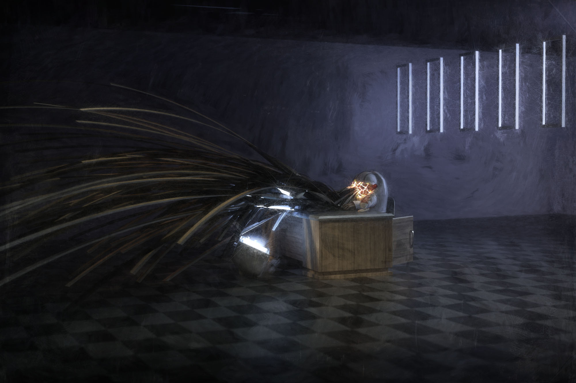
Personal work, Office and Ice Study
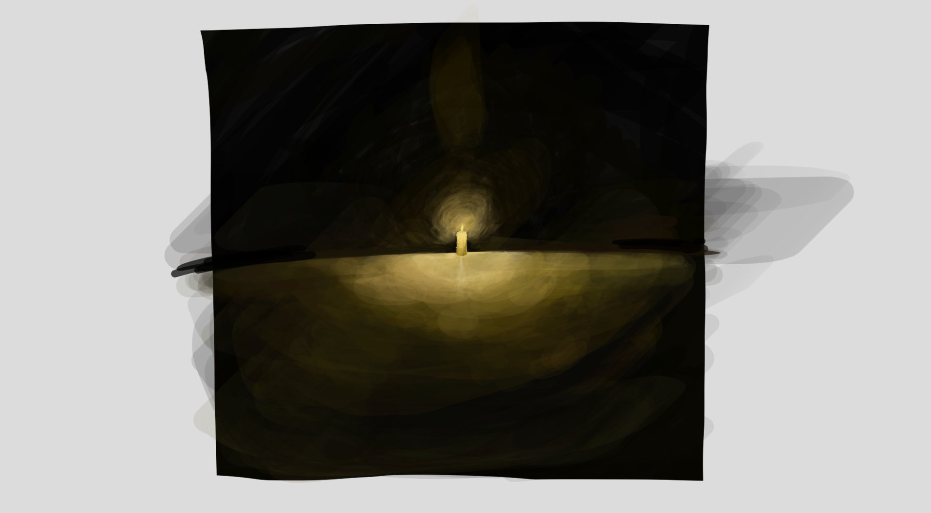
Worked up two CGI personal projects this weekend. The astronaut "Office Hell" image was to work on interior lighting, dynamics as curves and some simple UVing. Also shattered the helmet a bit to get those cracks which is always fun to do. Then I brought it all into Painter to explore some treatments in there. I wanted to take it away from the fully clean CGI look and grunge it up a bit.
The Ice Flowers was done in responce to Makoto Azuma's installations which are awesome looking. I wanted to see how close I could come to those using Modo. Besides some work on modeling the ice block I am pretty happy with how it came out. Fairly minor post in Photoshop adding some slight grain and darkening the foreground. Took 8 hours to render that out using 38 cores.


Kubricks' 2001: One Mans Incredible Odyssey
Awesome blog post on the VFX in 2001 a Space Odyssey. Great read.

Doug Trumbull: "Filming of the 'Dawn of Man' sequence took place entirely on only one stage at the studio. Distant backgrounds for all the action were front-projected eight-by-ten Ektachrome transparencies, using probably the largest front-projection device ever made, and constructed specially for 2001 by Tom Howard. The projector consisted of a specially intensified arc source with water-cooled jaws to hold the oversized carbons, special heat-absorbing glass, giant condensing lenses which would occasionally shatter under the intense heat, special eight-by-ten glass plate holders and positioning mounts, an extremely delicate semi-silvered mirror, and a specially built nodal point head so that the camera could pan, tilt, and zoom without fringing of the image."
"Tip Well" Featured on This World's Against Me.
The new portal website for predatory friendly records, This World's Against Me is featuring my bar series "Tip Well You Bastards" in the photo section with a lovely write up. Swing on by and check it out.
MassMarker- Phone VFX utility
Just found the Mass Marker app VIA reddit and this could really come in handy for phone composites that people are shooting. Neat little idea.
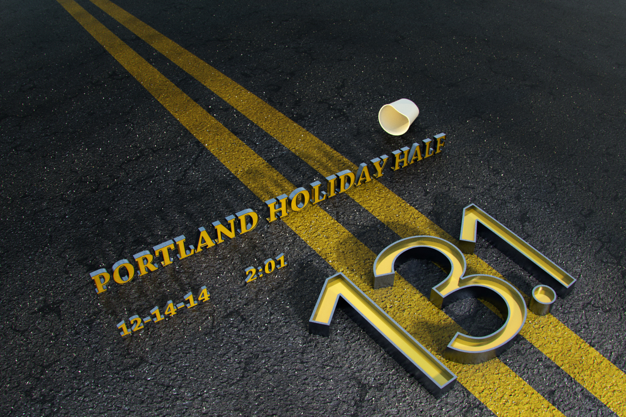
Holiday Half Study
Wanted to do a little project for Sara since she just ran the Portland Holiday Half and this is the result. Wanted to work on my text chops.
Uberball by Richard Yot
Awesome video and free Uberball from Richard Yot to help work on your shaders in Modo. The scale slider is really useful for me personally.
Uberball is the most advanced shader ball for modo, it will let you test your shaders under a wide variety of conditions. Download Uberball for free at: www.itchy-animation.co.uk/modo/Uberball.zip
Made with MIschief
The Foundry, makers of my fav 3d program Modo, just released a sketching program called Mischief and so far I am having a ton of fun with it. While I would not consider myself someone who draws stuff from scratch I do enjoy it and have been dabbling in Painter and different Photoshop techniques to do hand drawings for years. So far this program is the simplest and most intuitive to use for me. Just the other day I tried showing Painter to someone who is a accomplished painter and it's just too freaking complicated to easily use for anything. With Mischief if you want a bigger brush, zoom out. Smaller brush? Zoom in. Kind of how it should work. Plus, you can zoom in forever without any pixelation. It is the most bizarre thing to do and really awesome. This is the first thing I did in it last night, once again I am not a drawing type of guy but it was easy to use and sketch in. I could really use this when concepting or storyboarding. Oh yeah, bonus, there is a free version and a $25 version. You really can't say no.


Personal Work: Modo Stencil Study
Was working with stencils, replicators and volumetric lights last night and pulled this one off. The volumetric light started breaking up into almost a plasma type feel. Included the AO render as well so you can see the model without the volumetric light turned on. Interesting shape there as well.


Work: New / Old work in the Portfolio
Bunch of stuff came out of embargo and I have been slacking on updating the portfolio so I build up a few more examples and posted them this week. Some older some newer. Made some fun gifs as well. If you have a sec go take a gander.


Work: Danklife featured on Adweek Talent Gallery.
The Nike Flyknit project we worked on with Ryan Unruh has been featured on the Adwek Talent Gallery as of today. Yay!
Personal Work: Grass Fields.
Just picked up a bunch of new models of grass and did this quick test render with a stock photo backdrop. It is a tad "glossy" on the plants but I enjoy it visually quite a bit. Great models...


Holy crap: HP Announces 36-Core Desktop Workstations
"The new Z840, Z640, and Z440 desktops are more quiet and power-efficient than their predecessors, but the big news was the support for 36 processing cores on the Z840 and Z640. Yes, we all asked if the number was a mistake. HP showed us the system monitor, which displayed a total of 72 threads (doubling the core number via hyper-threading)."
Wow, that with WD's new 10 TB drives would be quite the workstation. Might need to upgrade my Wintel box soon ;)
Tuts / info: Skin materials
This post on the Modo forums go into all sorts of crazy detail about getting realistic skin shaders. It's a gold mine of ideas and information for any program, not just Modo.
"Top Layer/Skin Surface - This is pretty flat/desaturated. It's basically just the cells of your skin, most of which are dead. Although I would think this map would be colored a bit if the character/model had some darker pigmentation based on race etc. Perhaps moles/liver spots, tattoos, make up etc.
2nd Layer - This is just below the skin. Sort of a more saturated version of the surface/skin map. There is blood and active alive tissue, but for the most part, is just "more layers of skin". Perhaps moles/liver spots, tattoos etc.
3rd layer - This is where most of the color comes from. Fat, blood, muscle, connective tissues etc. This map is generally very contrasty and saturated. Really think about what elements would be contained at this level - reds and blues for veins and vessels, pinks for muscle, connective tissue - pale yellowish whites for connective tissue/tendon, darker brownish yellows etc for fat, lighter desaturated white/yellows for bone etc.
4th Layer - Backscatter map - this map is more or less a mask, dictatiing where and how light will pass through the skin material, on thinner areas like the ears, as well as the general darker, reddish coloring.
Spec/Gloss 01 - General spec/oil.
SPec/Gloss 02 - Extra shiny/wet areas, on top of the oil layer, like lips, around eyes, maybe on nose or forehead"
Personal Work: DoF, Bokeh and particles study.
Little study I did last weekend exploring DoF, bokeh and some interesting particles and dynamics. The bokeh has too much noise for me but I can not for the life of me figure out how to clear that up.

Building 3D with Ikea
"
Today, around 75% of all IKEA’s product images are CG, and they have a ‘bank’ of about 25,000 models. “These are all created at a ridiculously high resolution,” explains Martin, “We render them in 4Kx4K, and they need to hold up to that resolution. We need to be able to do whatever we like with the renderings - print them on large walls in the stores if we need to. Even if most of them are only ever used on the website, they all have the capability to be printed very high-res.”
The first entire room image to be created in CG for one of IKEA’s catalogues was in 2010. “There were a LOT of people involved in that image,” says Martin. “As you can imagine, the first time you do something, everyone wants to have a look! But then the catalogue after that had four or five images and it really took off.”
“The most expensive and complicated things we have to create and shoot are kitchens. From both an environmental and time point of view, we don’t want to have to ship in all those white-goods from everywhere, shoot them and then ship them all back again. And unfortunately, kitchens are one of those rooms that differ very much depending on where you are in the world. A kitchen in the US will look very different to a kitchen in Japan, for example, or in Germany. So you need lots of different layouts in order to localise the kitchen area in brochures. Very early on we created around 200 CG exchanges versions for 50 photographed kitchens in 2008, with the products we had - and I think everyone began to understand the real possibilities.”


Very interesting write up over at CG Society. Took Ikea a number of years to make the switch but they did.
On a side note, V-Ray for Modo exists now in Beta and hopefully I will be able to run some tests with it soon. Grant Warwick has a very impressive looking Mastering V-Ray class I'd love to go through. As far as I can tell Modo does not seem to have a specific in-depth shader tree / node class. And yes, I have watched all of Richard Yot's stuff I could find but it is more about rendering and not shader tree specific. ;)
Art: CGI Art of Lee Griggs
Lee Grigs does some amazing things with Maya. His Blog here with a tutorial. Now can I translate that into Modo? VIA Colossal


Art: Gediminas Pranckevicius Illustrations
Gediminas Pranckevicius makes some really luminescent illustrations. I would go to town with some replicators to try and do something like this in 3d. Getting that rich atmosphere would be damn impossible though.


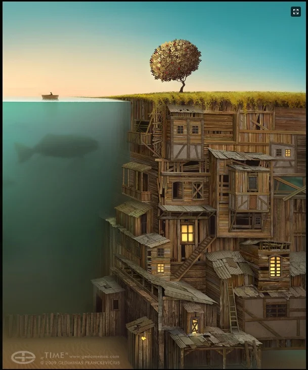
http://gedomenas.com
Time making of http://gedomenas.com/timemakingof/time
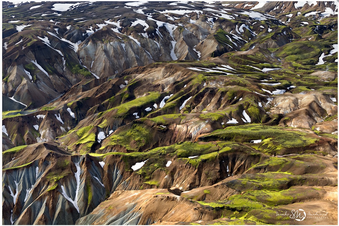
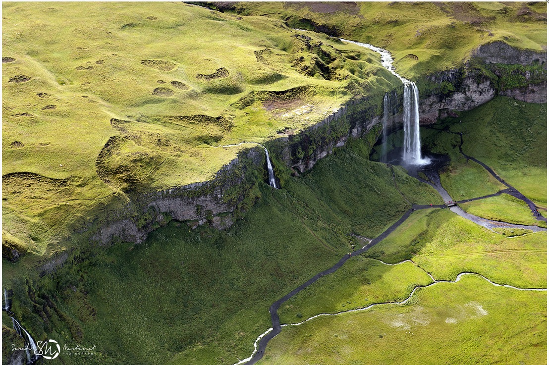
Art: Sarah Martinet Aerial Photos
Was looking at Sara Martinet's Aerials photos last night and I really like the post process she uses. It's subtle but flattens out foreground to background in a interesting way which makes it feel painterly while avoiding the HDR uncanny valley.