Modern Lighting tip
Jill Greenberg lighting setup and lighting diagram | Lighting For Photo
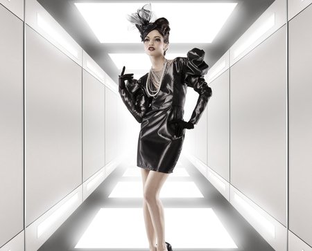
David Bicho's tribute to Jill Greenberg, using her characteristic lighting setup. With a lighting diagram and a description. Nicely documented.
Bokeh and how to fake it.
Start with a 16-bit picture (8 will work too, but for mathematical reasons you’ll get better results with a raw image) with really sharp well-focused point sources of light (street-lamps, christmas lights, ferris wheel bulbs) and then run a “Filter->Shape Blur” on the part of the image that you want the custom bokeh effect to show up in.
Thoughts on Post production....
This always comes up that So and So relies too heavily on Post Production to make their images look good and it always gets under my skin. The darkroom and photography has been about manipulation since it's birth. Here is the master of manipulations himself, Ansel Adams.
Canon EF 100mm F2.8 L IS USM review from DPReview.
Canon 100mm F2.8 L IS USM Macro Lens Review: 6. Conclusion & samples: Digital Photography Review
There's little doubt that, all round, this is one of the very finest lenses we've seen - optically it's superb, and operationally it works very well too, with fast and positive autofocus, and one of the most effective image stabilization systems currently available. Throw in the high build quality, including dust- and splash-proofing, and it all adds up to a very desirable package indeed.
Sharpest lens out there. I have the older version, may be time for a upgrade...
Jamie Kripke, GoLite campaign
I helped Jamie Kripke out with this campaign for GoLite which is shown over at The Denver Egoist.
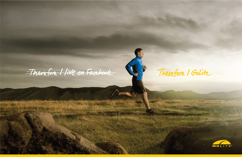
Sukle Advertising & Design, Denver just finished up a new campaign for GoLite, highlighting the company's Spring/Summer ‘11 trail running, hiking and travel apparel. The images were shot by Jamie Kripke of Boulder. Here's what they had to say about the campaign.
"Since its beginning, GoLite has been all about lightweight gear made for the trail. Whether it’s an after-work out-the-backdoor loop, backpacking the Colorado Trail or connecting the dots on an overseas adventure – the more time we spend on the trail, the better we feel.
The insight for this campaign is about choices. The choices we make determine how much time we have for the trail. Do I choose to watch some reality TV or do I get off my ass and go for a run? Do I pack the blow-dryer, the curling iron, the straightener AND the krimper? [Or GoLite?]"
Really fun smooth project. Jamie has such a great eye for subtlety that taking his images to the next level is effortless. He is the example of a photographer who understands that this look does not entirely happen in Post and has everything to do with the photographer's eye. Many photographers just lean on the post way to heavily to achieve this look and it never gets to this level.
I should be posting the before and afters in the portfolio as soon as I get some free time.
Neil Burgess on the death of Photojournalism
We have now reached the stage where magazine supplements offer me less for a story which might be used over a cover and eight pages than their associated papers pay me for a single picture of a celebrity. The picture editors shrug and say, “This is just the way it is.” But, it is an active decision that has been taken by the managing editors who believe that photojournalism is not valued, it can be got for free, and so needs no budget. Money is still around in newspapers, it’s just that it’s spent on other things.
I woke up this morning with a dream going around in my head. It was as if I’d been watching a medical drama, ER or something, where they’d spent half the programme trying to revive a favourite character: mouth to mouth, blood transfusions, pumping the chest up and down, that electrical thing where they shout “Clear!” before zapping them with 50,000 volts to get the heart going again, emergency transplants and injections of adrenalin …, but nothing works. And someone sobs, “We’ve got to save him we cannot let him die.” And his best friend steps forward, grim and stressed and says, “It’s no good. For God’s sake, somebody call it!”
Okay, I’m that friend and I’m stepping forward and calling it. “Photojournalism: time of death 11.12. GMT 1st August 2010.” Amen.
<A href="http://www.epuk.org/Opinion/961/for-gods-sake-somebody-call-it">Neil Burgess on the death of Photojournalism.</a>
Sad but true. But I have to say there is a glimmer of hope and that is the iPad / tablet computers. I know I have said it before, but you just can not fuck around with shitty images on those things. Plus it seems like people are willing to shell out $5 a issue for it. That is some serious revenue for the magazines who no longer have to print and ship dead trees around.
VIA wood s lot who proves yet agin he is a much netter blogger then I.
Tom Chambers Photography
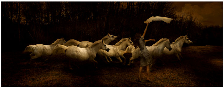 Tom Chambers has some nice photo montages in his Entropic Kingdom series.
VIA wood s lot.
Nice find.
Experts: Ansel Adams photos found at garage sale worth $200 million - CNN.com
Los Angeles, California (CNN) -- Rick Norsigian's hobby of picking through piles of unwanted items at garage sales in search of antiques has paid off for the Fresno, California, painter.Two small boxes he bought 10 years ago for $45 -- negotiated down from $70 -- are now estimated to be worth at least $200 million, according to a Beverly Hills art appraiser.
My illustrations featured on Astute Graphics Blog.
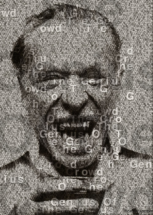 The makers of the Illustrator plug-in I used in this project called Phantasm CS has featured it on their Astute Blog today. Thanks guys!
This is a pretty great tool for halftone patterns and I was pretty stoked that they enjoyed the imagery I made using it. Fun stuff.
You can see the original post with some more details here, Word Illustrations.
Lighting Studies #3
[gallery link="file" columns="2"] Had a lovely BBQ the other day (Thanks to all who made it!) and when the wife walked in with these tomatoes for the salad.... well, she had to put off making the salad for a bit. 9 lights were used along with everything and the kitchen sink. Turns out tomatos are stupidly difficult to shoot and I am still not entirely in love with these. I could not get a good background to work so I just went with default black. But since these are just studies I am posting them anyways.
I had to use a diffusion screen above for the backlight which also had some diffusion clipped to it.
Metal screen on two other side back lights to bring them down and scatter highlights. These are what are giving the highlights around the stem on the horizontal.
A focusing lens so I could get a dollop of light onto the stem. Metal screen with a postage stamp opening focused pretty harshly. Took some effort to get it blended with the other lights.
Sculpting wire underneath the tomato so it would stand up.
A Prism in front of it that took the front light and bounced it up a bit more focused.
I think that's all. I should really start photographing the lighting set ups I guess... lol. And so much for B&W formalness. That lasted all of one post....
Lighting Studies #2
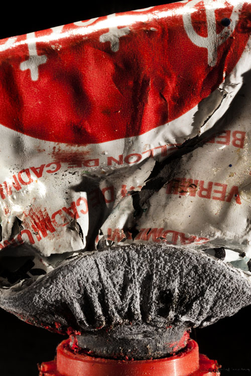
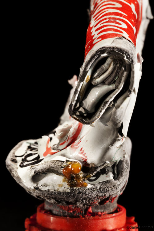
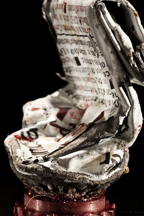
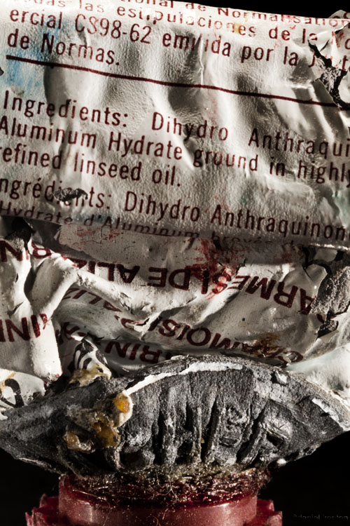
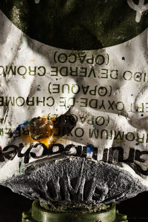
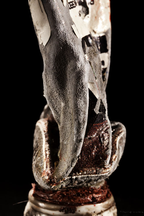
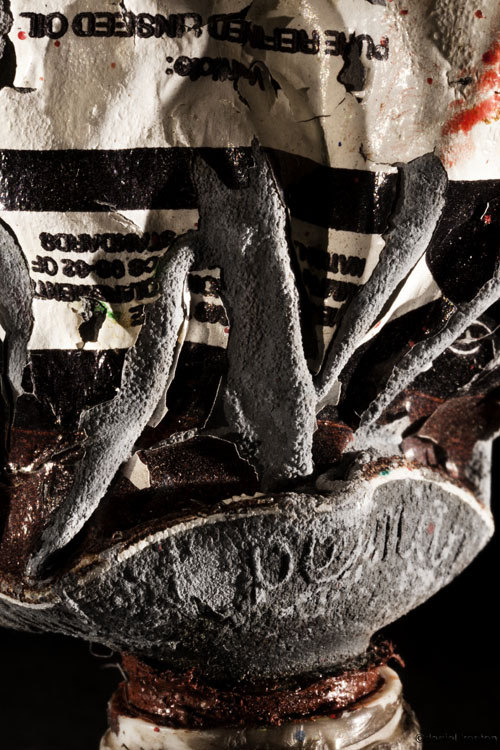
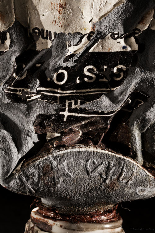
More Lighting Studies done over the weekend. Here I busted out my old set of oil paints and found some of these wrinkled old gems in there. The oil paint was still good after 20 years, crazy stuff. Six light set up for this series but once I had the lights set right I could just move in new tubes of paint and position them as I wanted. The hardest part was getting the composition and backgrounds set up in a interesting way. I had 5 different sets I went through till I just went to close crop and black BG. I could see this mounted all into one frame in rows of three. Hope you like them.
How to create SuperMacro lens
All of this is so beyond me it's really astounding. Plus the video quality is actually awesome. Seriously, this is some hard core amazing work here.
Lighting Studies
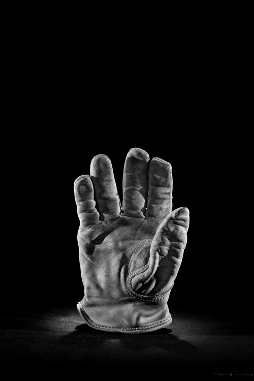
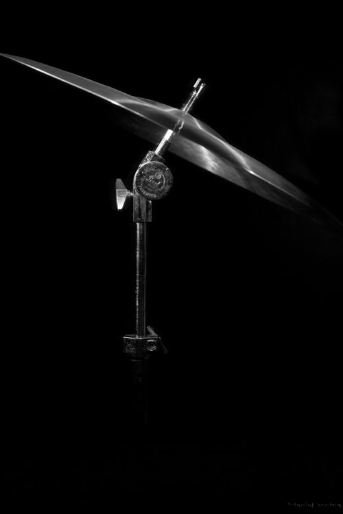
Did a couple lighting studies yesterday here in the studio. Man, I just have to say it again, I love my Dedolights. I am using those with a Foba Combitube System here and it's addictive. Very enjoyable to throw light around with this set up.
This cymbal was just a attempt at stark and clean. Used about 4 lights on this as you can see by the streaks of light on the top. Had 4-5 little flags all around to help keep the highlights at bay. The glove had 6 on it. 3 from the back, 2 from each side and one snooted just on the fingers in front for some fill.
Forcing myself to explore B&W imagery again as well. I get a little too distracted by color sometimes and I want to bring these back to more of a formal study of texture and light. The goal is to shoot some random object a day. Hope you all enjoy them.
The glove is supposed to be a bit creepy by the way. The wife comes in and says, "Nice murder glove." ;-)
Book photo for art project.
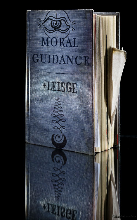 Jason Leisge just finished a art project for Parking Block Publishing where he used a book as a sketch book. You'll have to wait for the inside pics. Me no post sneaky pics of it for you.
You can check out the blog behind Parking Block at Such Luck, quite a nice Chicago-centric blog on art, skateboarding and food.
Shot this with some awesome Dedolights, which are crack for any still life shooter. These puppies are a whole lot of fun to use. Thanks goes out to Hill Street Studios for doing a work swap for these.
I'm tired and need more coffee.... and I'm grumpy... Bah.
Silver Falls Painting
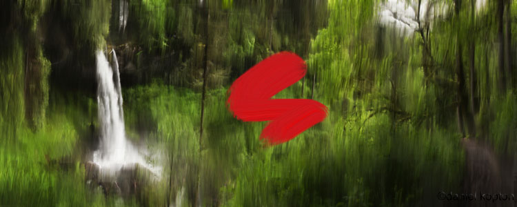
Here is a painting I worked on yesterday based upon This shot of North Falls. I have been messing with Painter for about 6 months but I still do not really have a good take on it. This is inspired by the painter Gerhard Richter.
I did some test prints on canvas but I am not to thrilled with the blacks right now but I plan on trying some varnishes to see what those do. The idea of working with oil paints and mediums again is kind of exciting, hoping to get this moving forward.
Nadav Kander – Yangtze, The Long River
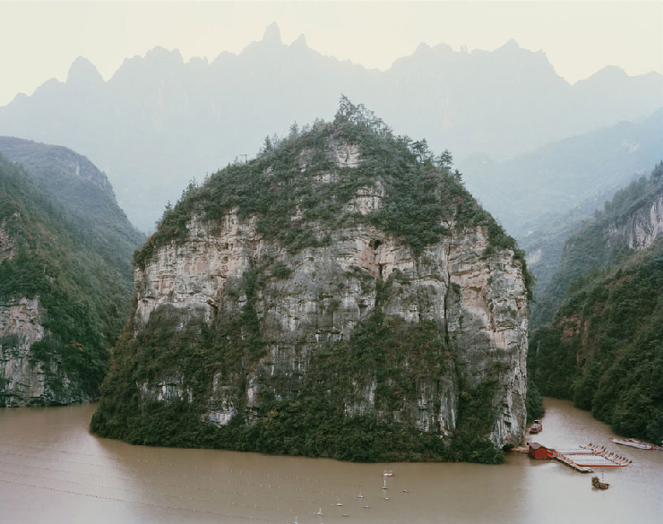 More at We make it Good. Really nice stuff, great eye.
Silver Falls Images
[gallery link="file" columns="2"] Here are some images from the recent Silverfalls hike we went on. I went for a different approach to my composition on this shoot and I am happy with the results. I tried to pull back and really get the falls in the environment not just by themselves. I plan on printing the North Falls Pano on stretched canvas. Excited about getting into that.
The one South Falls shot I made look like a aged beer ad in your favorite pub. That one was cheesy-riffic so I went with it.
New art print.
New art print available, printed this at 12 by 40 and that seems to be the perfect size for it. Black border like back in the cibachrome days. The macros were shot on a G9 and the tree moss on a 1ds M2. It was a fun series I was doing about a year ago though I never laid them all out into one print like this.
