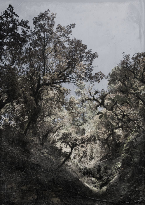
Marian Drew

Drew sets her deceased on kitchen tables amidst fruit and fauna in a manner that evokes Renaissance still-life painting. In particular, reference and parallels are found in the vanitas genre, which were constructions by painters to warn of the bouquet of hubris man weaves. The senselessness of death for Drew’s subjects is poignant even more so with the realization that these animals will not be consumed as the fish and fowl shown in classic still life. Sport is cruel; careless discard is unforgivable. Rather than bucolic examples of a landowner’s fortunes or flexed exertions of man’s control over the natural world, Drew’s tables are dressed to implicate the disregard humanity has for the wild animal. The warmth of home, sweet home’s family gathering to share a meal is tainted when barriers are removed between the beasts and us.

Marian Drew, photos. Nice stuff. I am a fan of this look.

Beacon Rock Hike

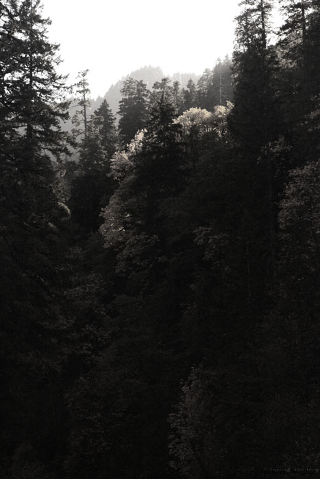
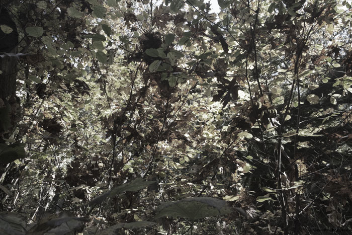
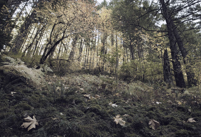
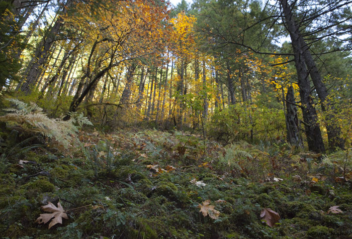
[gallery link="file" columns="2"] Went for a hike at Beacon Rock this weekend. Nice easy hike with some amazing views. You would have to work hard to take a bad photo so there are a few more here.

The rise of The Poison Picture

Fair Trade Photographer: Microstock: why would a reputable company do this to themselves?

They say a picture is worth a thousand words. Well, this one has a lot to say. It says microstock. It says perfect-people perfect-world lowest-common-denominator cookie-cutter pile-them-high sell-them-cheap image.

Why would a reputable company want to be associated with those words?

And from the comments:

This is another technology game-changer... it is always impossible to know what will come along and how it may turn an industry on it's head. This is something that I believe will turn microstock on its head and put it in its place - which is on the websites of micro-companies and fly-by-nighters, and not on the website of any company which values its image.

Picture buyers (and designers) who think they can get away with using microstock images have now got to contend with the fact that with one click of their mouse, anyone can find many many examples of the same image being used across the web. And that just makes it far too easy for a company's reputation to be ridiculed.

Major corporations are already aware of this and that is why you will no longer find microstock images on their websites.

Say hello to the era of the Poisonous Picture....

Good write up if you ever have to sell a better image to a client.

Thanks Charlie!

Puppet warp in CS5

Interesting to see how this works with high resolution files. Content Aware Scale introduces way to much artifacting so I have no faith in Content Aware Fill. This might be useful though.

On a side note, how long till we have a icon which denotes a picture as a Illustration versus and real Optical Photograph?

Erwin Olaf interview

The F STOP » Professional Photographers Discuss Their Craft » Erwin Olaf

Olaf: I work with several retouchers for every project. It’s like in the film industry, there’s an editor. I see myself more as a director nowadays than as a pure photographer.

F STOP: What do you like about 60s and 70s lighting? The top light?

Olaf: It communicates that we are in artificial world, because it’s not natural. I prefer a little softer, and not really hard light, but soft box light most of the time. But it is a dream world, you know.

F STOP: And everything in your shoot reinforces that?

Olaf: Yes, it comes all together and it builds up to one atmosphere.

Some very interesting points in this interview. Good read.
Thanks Jamie.

Snow!

_MG_2689 copy _MG_2693 copy

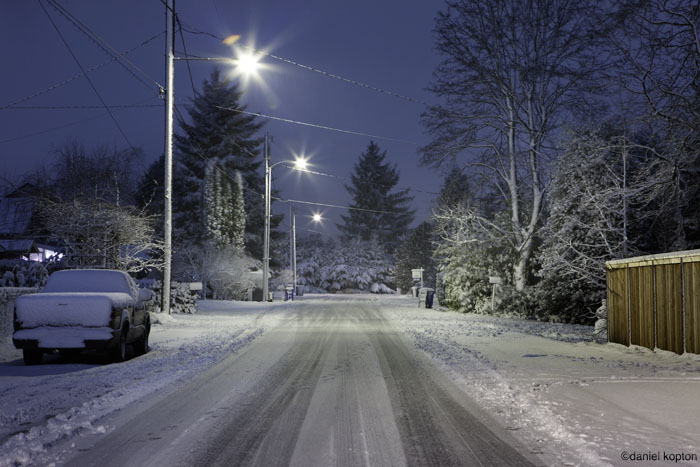
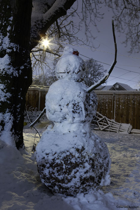
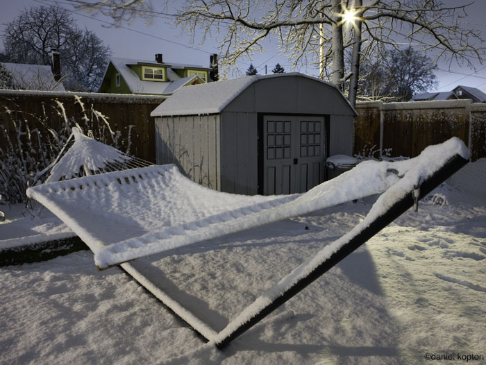
_MG_2697 copyJust took a few snaps last night of the snow that hit us. The wife was none too pleased, lol!

First frost

[gallery link="file" columns="2"] Woke up this morning to some frost and the patio table we have had some cool patterns on it. So in the vein of Minor White I thought I'd throw a slaved flash under the table and shoot through the frost with a macro. Fun stuff.

But yeah, Frost... it's freaking cold.

Truth at Paris Photo

Art is about life and the art world is about money although the buyers and sellers, the movers and shakers, the money men will tell you anything to not have you realise their real motive is cash, because if you realise – that they would sell your granny to Nigerian sex slave traders for 50 pence and a packet of woodbines – then you’re not going to believe the other shit coming out of their mouths that’s trying to get you to buy the garish shit they’ve got hanging on the wall in their posh shops … Most of the time they are all selling shit to fools, and it’s getting worse.

-Damien Hirst

Time Lapse Cover Design For Macworld

Photographer Peter Belanger captured his work for a Macworld cover design by using time lapse and the finished video is remarkable. The amount of camera equipment used to get what appears to be a fairly simply shot is surprising.

VIA Derek Cooper's well done blog. I shall read up on some of his lighting now. And yes, getting the right table top shot takes a TON of gear and time.

Still life study with Grapes.

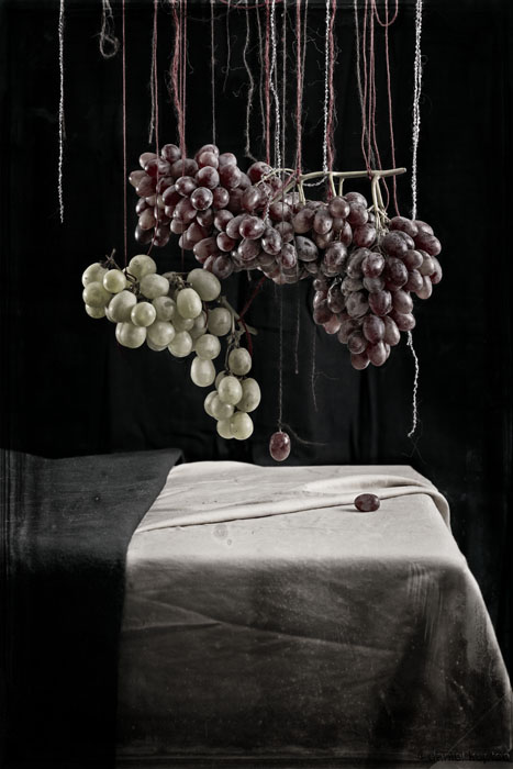
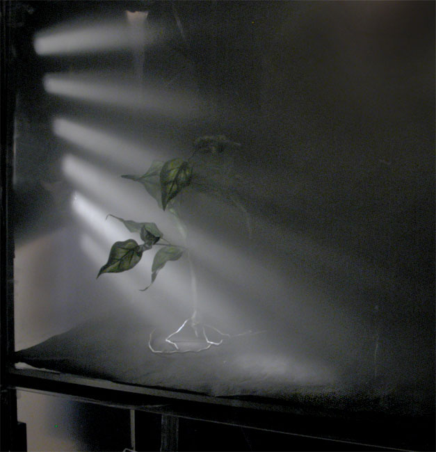
Still life with Grapes Still life study with grapes shot yesterday in the studio. Went to a wine shop for a tasting last Friday and it got me to thinking. Looking to get a triptych out of this series. It's heavily influenced by Joel-Peter Witkin, Zeke Berman and Pieter Claesz.

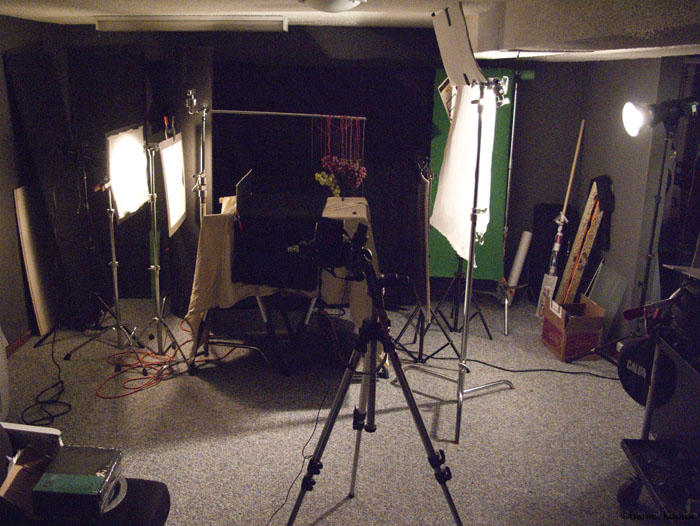
Here is the lighting setup: Grapes still life light set up.

Zeke Berman

zeke berman One of my college hero's seems to have finally got a good web presence and I am stoked to see that he is successfully playing with color. His 1985-94 series really made a impact on me as a young photographer. The tonal values on the glue gun strands in a real life black and white print is something to see. I remember spending hours in the studio / darkroom trying to get a tonal range close to his. The one time I got close and pulled the prints out of the fixer so happy only to have dry down kill it.

Major bummer......

Reason number 102937464538 why I hate the chem process. Dry motherfucking down.

3 Trees in Spring on Mt Tabor

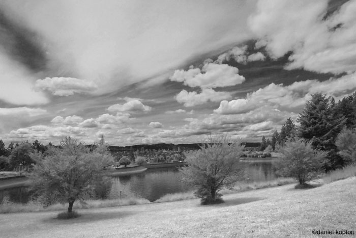
3 Trees in Spring on Mt Tabor. Just going through the archive and I found some outtakes from a HDR study which failed horribly, but the images on there own are quite nice. So I took it to B&W as is my thing right now.

On a side note, HDR looks great on the web but generally looks horrible printed. Just a FYI to all the Flickr folk out there.

Eagle Creek Trees

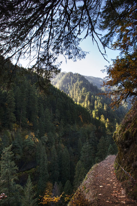
Eagle Creek in Oct. Here is a pic from this weekend up in Eagle Creek. Not quite a full B&W but I thought the hint of color is adding a lot of interest. It was also shot at high ISO which is adding some nice texture.

This also is the first post where I am consolidating the blogs to here. So no more Photoblog on it's own. I think having both of them in one should make it more interesting.